Love Designer Glasses were an opticians selling high quality designer glasses. The company had been successfully selling on the high street for a number of years and were looking to begin selling online, the whole website needed designing then building from scratch. In my role I was the sole UX/UI designer and would be there from the first kick off meeting, guiding the design through to completion. The site would be fully responsive and built in Magento, an e-commerce CMS.
Responsibilities
- Paper and digital wireframing
- Lo and hi-fi prototyping
- Accounting for accessibility
- Iterating on designs
Year
2014
My role
UX designer taking the app from conception to delivery
The Problem
LoveDesignerGlasses had no website meaning there was no way for existing customers to buy their glasses online. The company had no online presence to attract new customers.
The Goal
Create an easy to use responsive website allowing users to find and buy glasses along with reviews, a section for a newsletter sign up and content to help with user engagement.
Understanding the brief
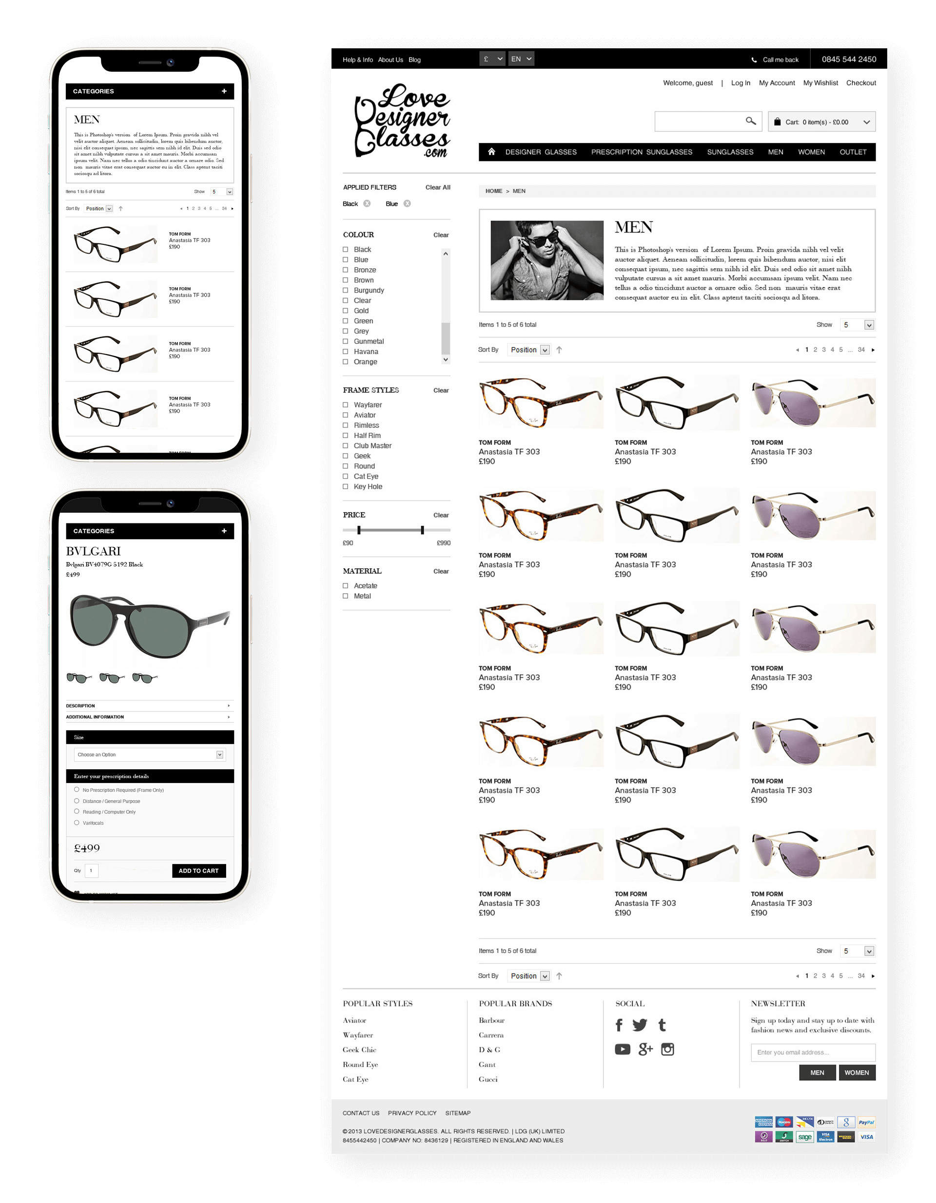
The design needed to reflect the quality of the products that the business was selling – the glasses were high-end, expensive products. Our kick off meeting revealed that some people collect glasses and are always on the lookout for the next new design. Liaising with clients, we drew up a list of competitor sites and sites for style inspiration. Eyewearbrands.com was the competition brought up a few times in our kick-off meeting. I took note of how the categories were laid out and clicked through as if I were going to buy a pair of glasses. This led through to the product pages where attributes such as lens sizes and coatings are selected before purchase. The product details page worked, but the attributes looked cluttered and daunting. There was also no opportunity to upsell on these pages. With regard to style, websites mentioned were net-a-porter.com and Topshop.
Pain points
1
Navigation
The user flow and navigation had to be coherent and the design had to be responsive as more and more users were using phones and tablets to make purchases
2
Accessibility
The site needed to be accessible for a wide range of users, colour contrast in particular had to be on point
3
Engagement
The app needed to include social aspects for more casual gamers
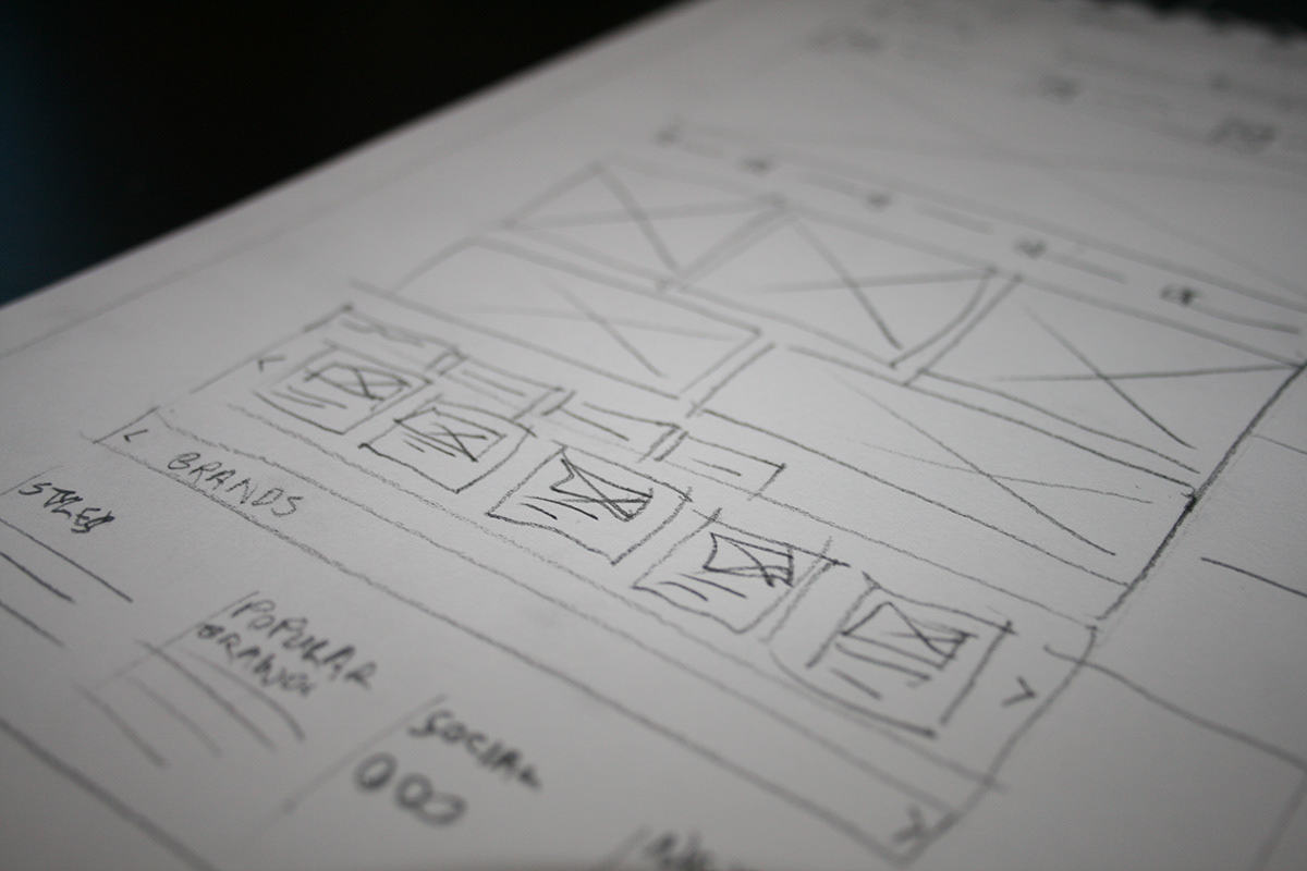
Paper wireframes
By creating multiple iterations of each screen in a paper wireframe I helped ensure the design would be suitable to address user pain points.
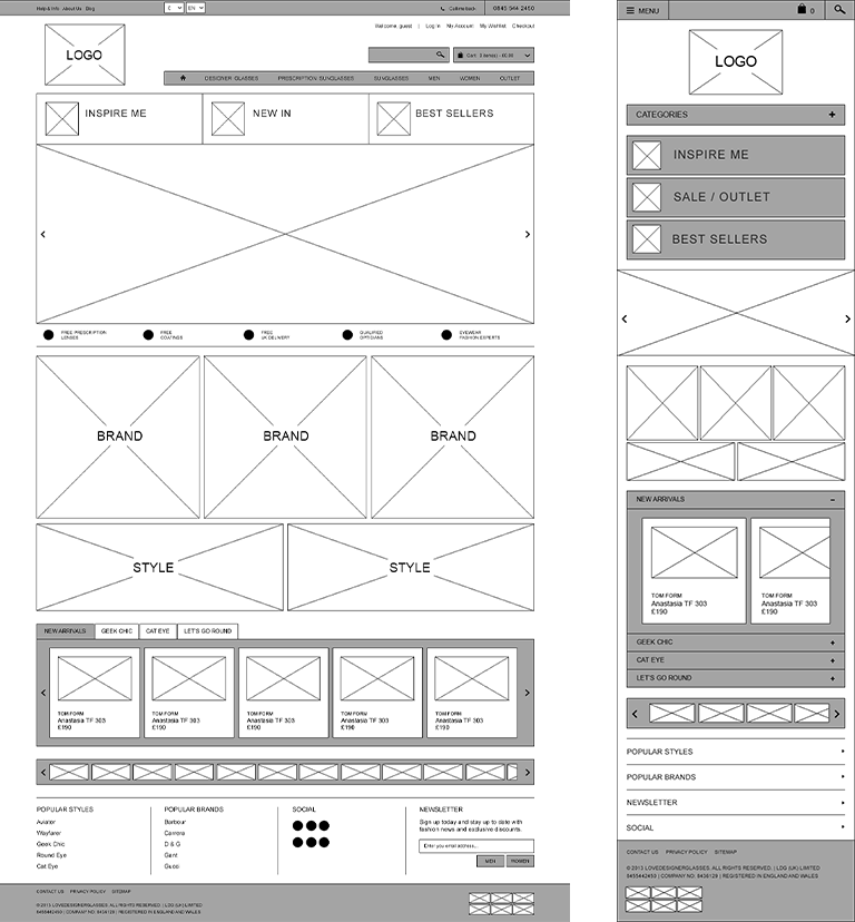
Sitemap and Wireframes
The client had an idea of the categories that would need going on the site, the head of marketing had a lot of experience from selling glasses online, having previously worked for the company’s biggest online competitor. I grouped categories given to me by client and produced a basic sitemap.
The glasses were split into top level categories such as, glasses, sunglasses, men, women, plus an outlet section. All of these categories where further split into categories so the user can browse by style, brand etc. In addition to product pages there needed to be space for content on main category pages mainly for SEO, plus a blog, about us and pages for the checkout process.
At this stage I started to sketch some very lo-fi wireframes iterating after feedback from the client and developers. Including users at this stage would have been ideal however due to lack of knowledge and business constraints at the time this didn’t happen.
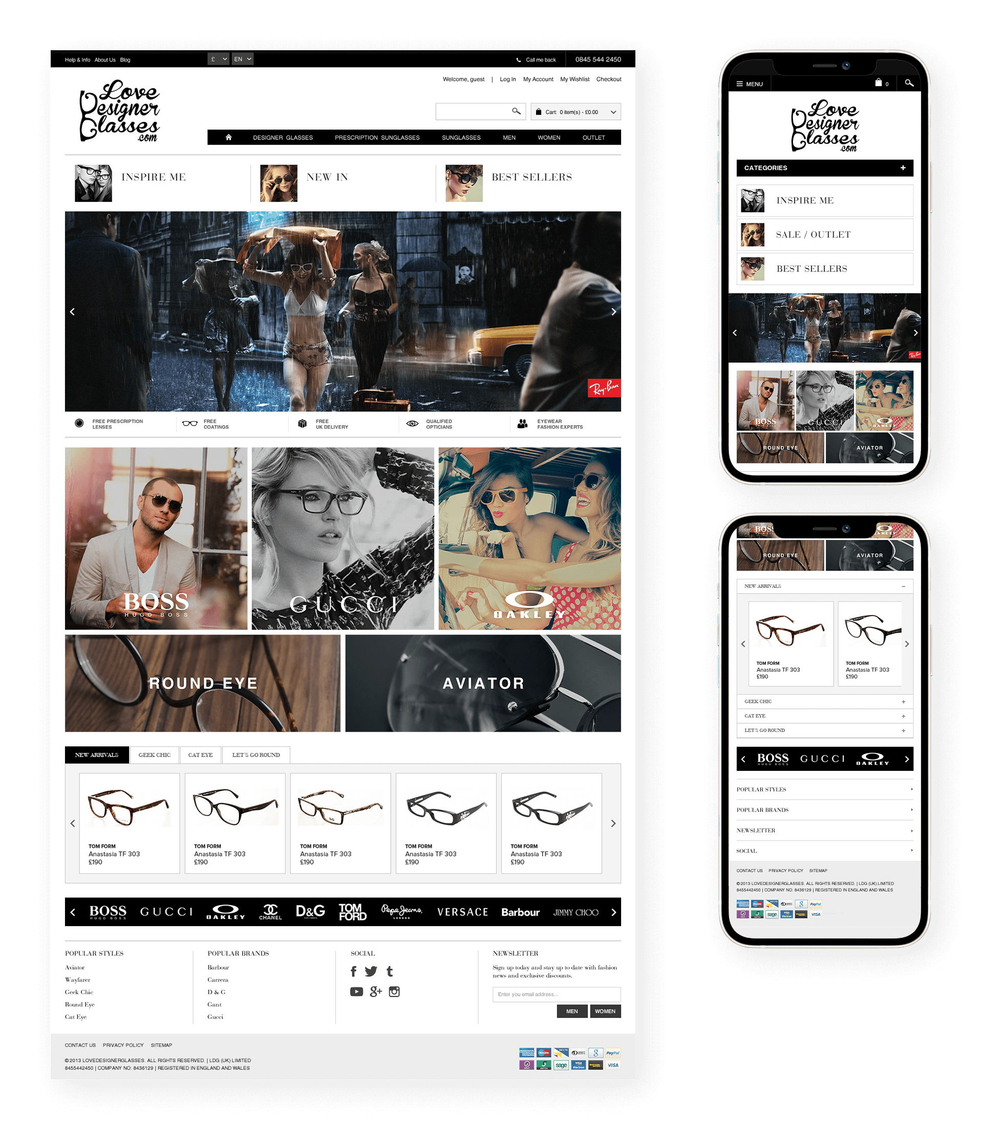
Visual
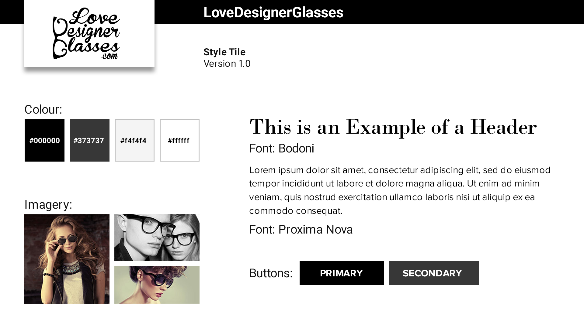
For typography I chose Bodoni for headers and Proxima Nova for the body text; these typefaces have a good contrast between the classy, thin, serif Bodoni and the more modern clean cut sans-serif Proxima Nova. Taking inspiration from a number of other fashion sites I chose to use only black, white and grey, with any colours coming solely from photography on the site, letting the products “do the talking”.
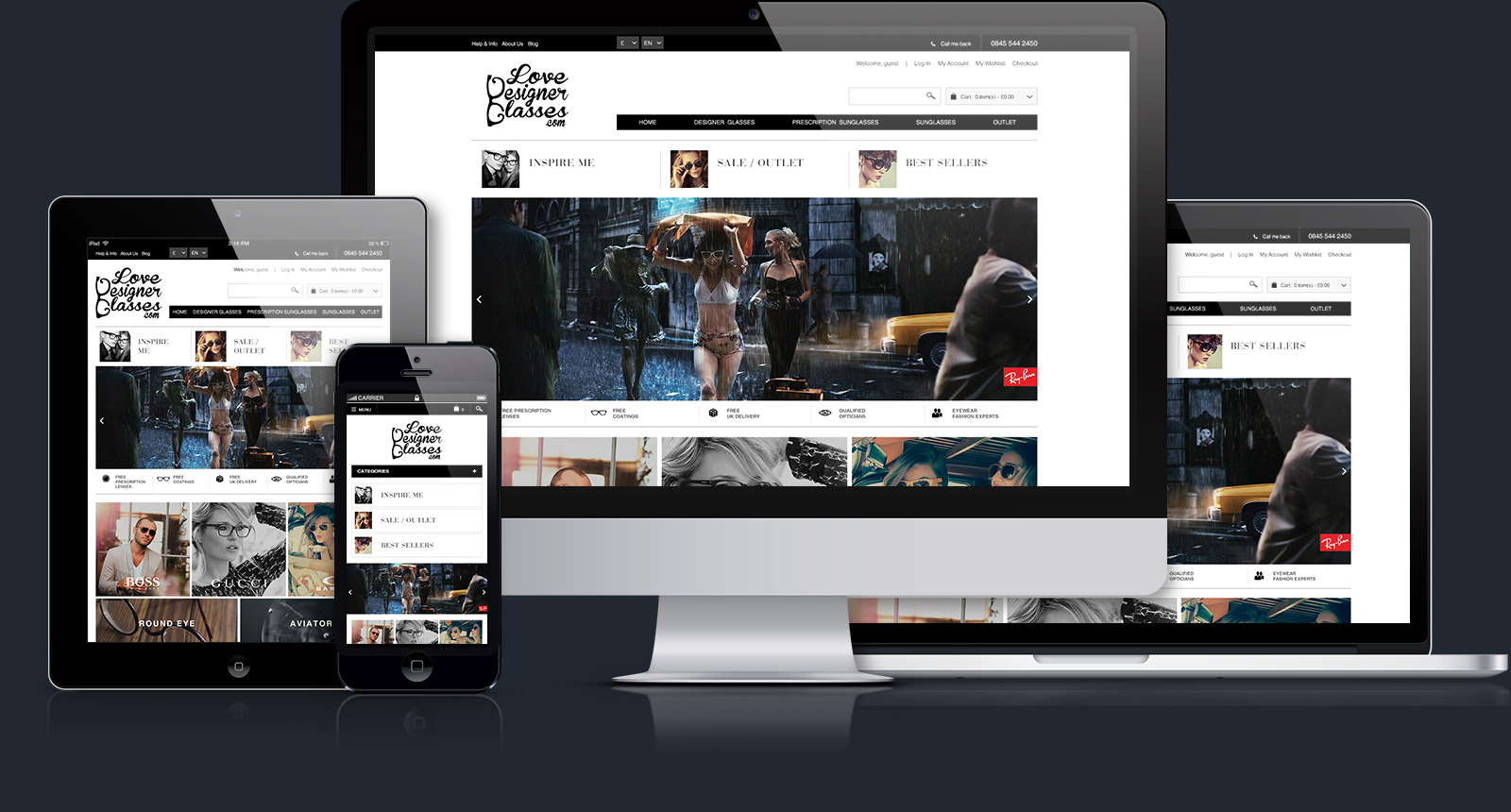
High fidelity designs and deployment
Takeaways
Value of User Testing
In hindsight, the project could have greatly benefited from the inclusion of user testing. This practice would have provided valuable insights and improved the overall user experience by addressing potential issues and refining the design based on real user feedback.
Evolution of Design Practices
In 2014, creating high-fidelity designs in Photoshop was still standard at my agency. Embracing more contemporary tools (at the time) such as Sketch would have helped speed up the process.
Importance of Design Thinking
A stronger emphasis on design thinking could have contributed to a more robust and thoughtful approach throughout the project.
Balancing Constraints with Client Satisfaction
Despite the potential for improvements through advanced methodologies and tools, it’s essential to acknowledge the constraints imposed by time and budget. The client’s satisfaction is a crucial aspect, and in this context, the project achieved the goal.