Moneysupermarket Group is a price comparison website-based business specialising in financial services. The website enables consumers to compare prices on a range of products, including energy, car insurance, home insurance, travel insurance, mortgages, credit cards and loans.
In my role I had the opportunity to be part of a core team of design system advocates tasked with a significant challenge – transitioning our legacy design system from Sketch to Figma.
Responsibilities
- Component Creation
- Illustration
- Photography treatment
- Motion Design
- Design tokens
- Typography
- Grid system
- Maintenance and updates
- Championing the design system
- Training others in Figma in “Figma Bites” sessions
Year
2023
My role
Visual Designer and core member of design system team
The Problem
Our organization had a wealth of design assets, including UI components, patterns, and guidelines scattered across various Sketch files. This fragmentation led to inefficiencies, inconsistencies in our product design, and hindered the collaboration between designers and developers. It was crucial for us to centralize our design resources and ensure that everyone was working from a single source of truth.
The Goal
Our primary goal was to streamline and modernize our design system by migrating it to Figma. The objectives were:
- Centralization: To bring all design assets under one roof in Figma, ensuring that every team member could easily access and contribute to the design system.
- Simplification: To simplify the existing design components, eliminate redundancy, and ensure a cleaner and more efficient design library. keeping everything accessible
- Standardization: To establish a clear and standardized structure for the entire library, including naming conventions for components, colors, and typography. Moreover, we emphasized visual consistency, ensuring that design elements across the brand aligned cohesively.
Establishing the Design System
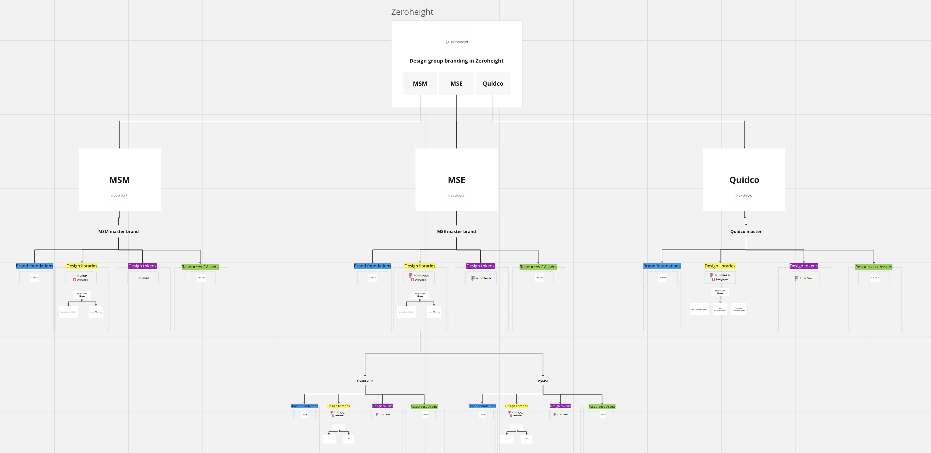
MoneySuperMarket Group encompasses multiple brands, including Moneysupermarket, Moneysavingexpert, Quidco, and the overarching group branding; the new design system needed to span all these. We had multiple workshops around how to approach the job, there was a lot to think about. After defining the system’s name (Blox) our team we divided up responsibilities and got to work.
The Migration
The Sketch files had accumulated a substantial amount of design debt over the course of their development. Given the inherent complexity of the Sketch software, certain aspects of the design system had become overly intricate and unwieldy. Consequently, during the migration process, it was imperative that we exercise discernment in determining which components to transition.
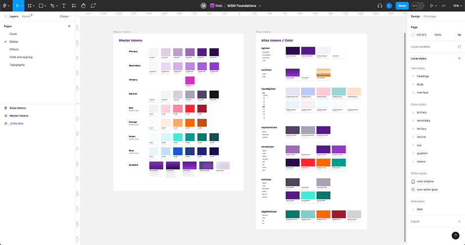
As part of this effort, I assumed the role migrating assets from the Brand Library, Question Set Components, and the Foundations Library, which included critical elements such as color tokens and typography.
Asset Creation
Before and after the migration part of my responsibilities have been to add to the design system. During my time at MSM, I’ve contributed to the growth of our visual resources by creating various assets from scratch. This included crafting vector icons and illustrations for web and app usage, as well as enhancing photography and 3D renders for on-site, emails, and hero images.


Motion Design
I previously worked on the production team at Booking.com, requiring animation skills. During my time at Moneysupermarket.com, I applied these skills to animate different components in the design system, such as app icons, screen transitions, and simple email animations.
It’s worth noting that there currently isn’t a designated section within the design system that provides official motion standards. However, I believe it’s a domain that warrants consideration in the future. Some of the animations I created are used on the website as GIFs or videos, while for the app, we utilized a plugin in After Effects to export animations as JSON files, ensuring smooth and compact vector files.
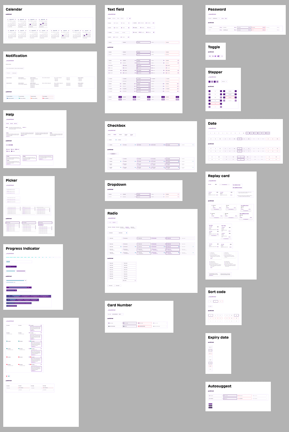
Question Set Components
Another of my responsibilities in the migration was the transfer of the Question Set library. Due to issues with transferring a Sketch file directly into Figma I meticulously built these components from scratch to ensure colour, typography, and other element linked up across the design system.
Considerations
Naming
Using clear, descriptive names for components to aid organization and searchability
Hierarchy
Nesting components logically for efficient design and manipulation
Variants
Creating component variants for different states and contexts to maintain consistency
Takeaways
Impact
The development and implementation of the design system in Figma have yielded remarkable results. This meticulously crafted design system has not only been successfully delivered but is now in full swing, actively fueling our design processes and ensuring a cohesive, efficient, and visually compelling user experience for our products and services.
What I learned
Participating in the creation of this design system was an invaluable learning experience. It allowed me to gain a deep understanding of the intricacies of Figma, ultimately making me more proficient and versatile in my design toolset. Additionally, the collaborative nature of this project allowed me to further refine my teamwork and communication skills, as I worked closely with fellow designers to bring this vision to life. This endeavor not only expanded my knowledge but also provided me with a significant boost in my ability to work effectively within a design team.
Next steps
1
Continuing user research to guarantee accessibility and a user-friendly experience across platforms.
Conducting further research with both developers and designers who use the design system to ensure its usability and identify areas for improvement.
2
Documentation throughout the libraries, then linking with Zeroheight, serving as a platform for sharing the design system with external parties. Work on this began but is still ongoing.