This was a self-initiated project for Google’s UX certification course. I decided to design and build a game preview app to help improve customer experience and retain customers at an arcade. I noticed that competitors have game preview websites but they’re often lacking in functionality and features. I wanted to create a product that could increase customer numbers and customer satisfaction.
Responsibilities
- Conducting interviews
- Paper and digital wireframing
- Lo and hi-fi prototyping
- Conducting usability studies
- Accounting for accessibility
- Iterating on designs
Year
2021
My role
UX designer taking the app from conception to delivery
The Problem
Customers in the arcade had no way of previewing games or locating said games inside the arcade. The arcade seemed old fashioned and wasn’t making the most of existing technology to enhance the user experience.
The Goal
Create an easy to use app that allows users to find games with reviews and a map feature; allowing users to cut down on time and feel more engaged with the arcade.
User research summary
I conducted interviews and created empathy maps to understand customers and their needs. A primary user group identified was working with adult gamers who wanted to save time and have a more immersive experience at the arcade.
Research uncovered some users are more casual gamers and head to the arcade for social reasons. For this reason I decided to add filtering for multiplayer games and a feature in the app to order food and drink from the bar.
Pain points
1
Time
The arcade is aimed at adults who want to quickly get to gaming without wasting time on bad arcade machines
2
Accessibility
The app needed to be accessible for a wide range of users and support filtering games by language
3
Social
The app needed to include social aspects for more casual gamers
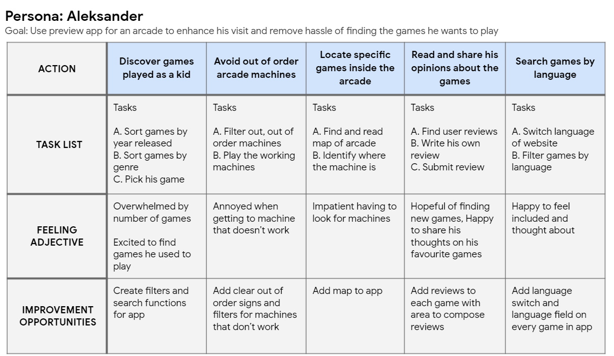
Personas and user journey maps
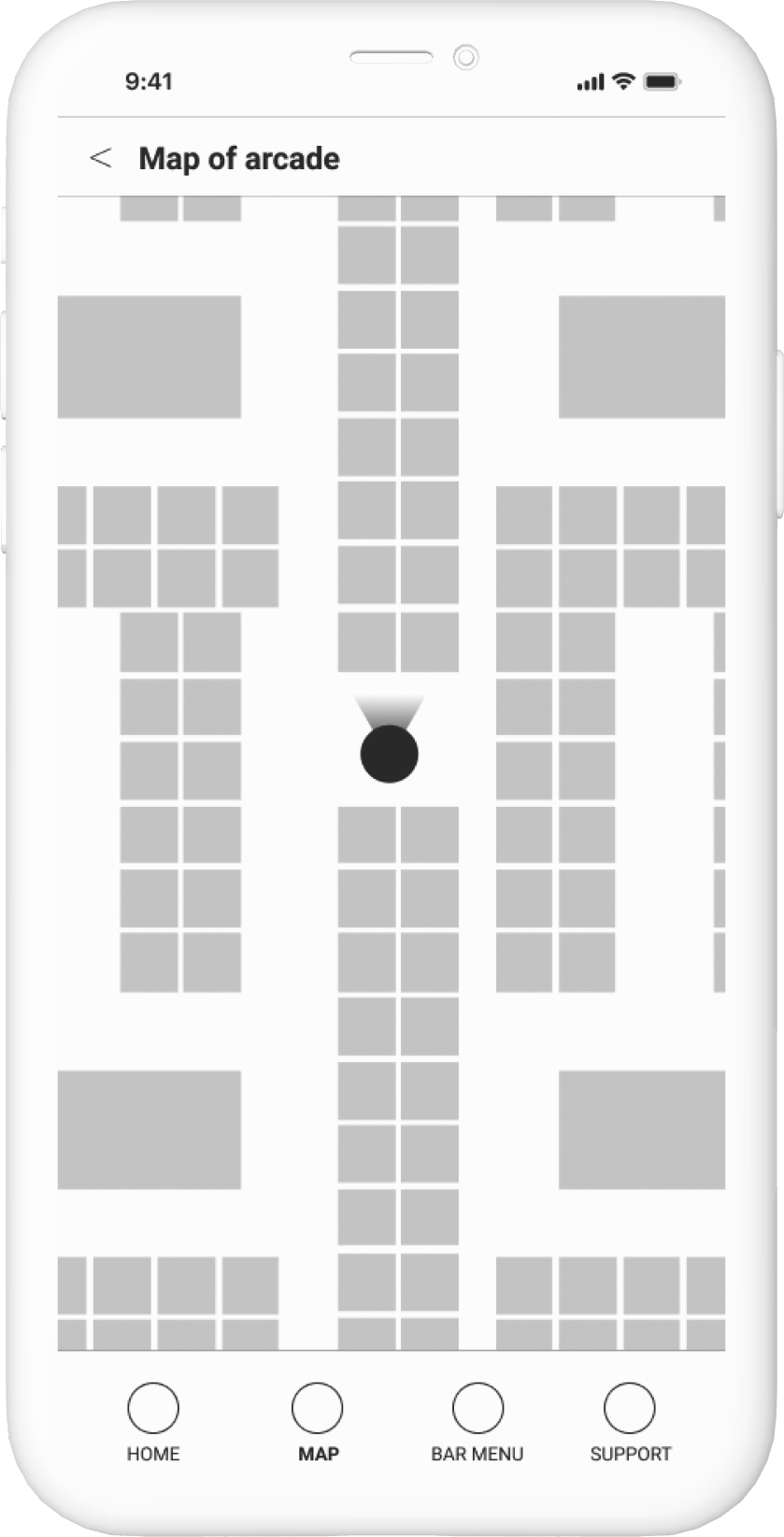
Alek’s user journey map revealed how helpful it would be for users to have language filters and a map feature
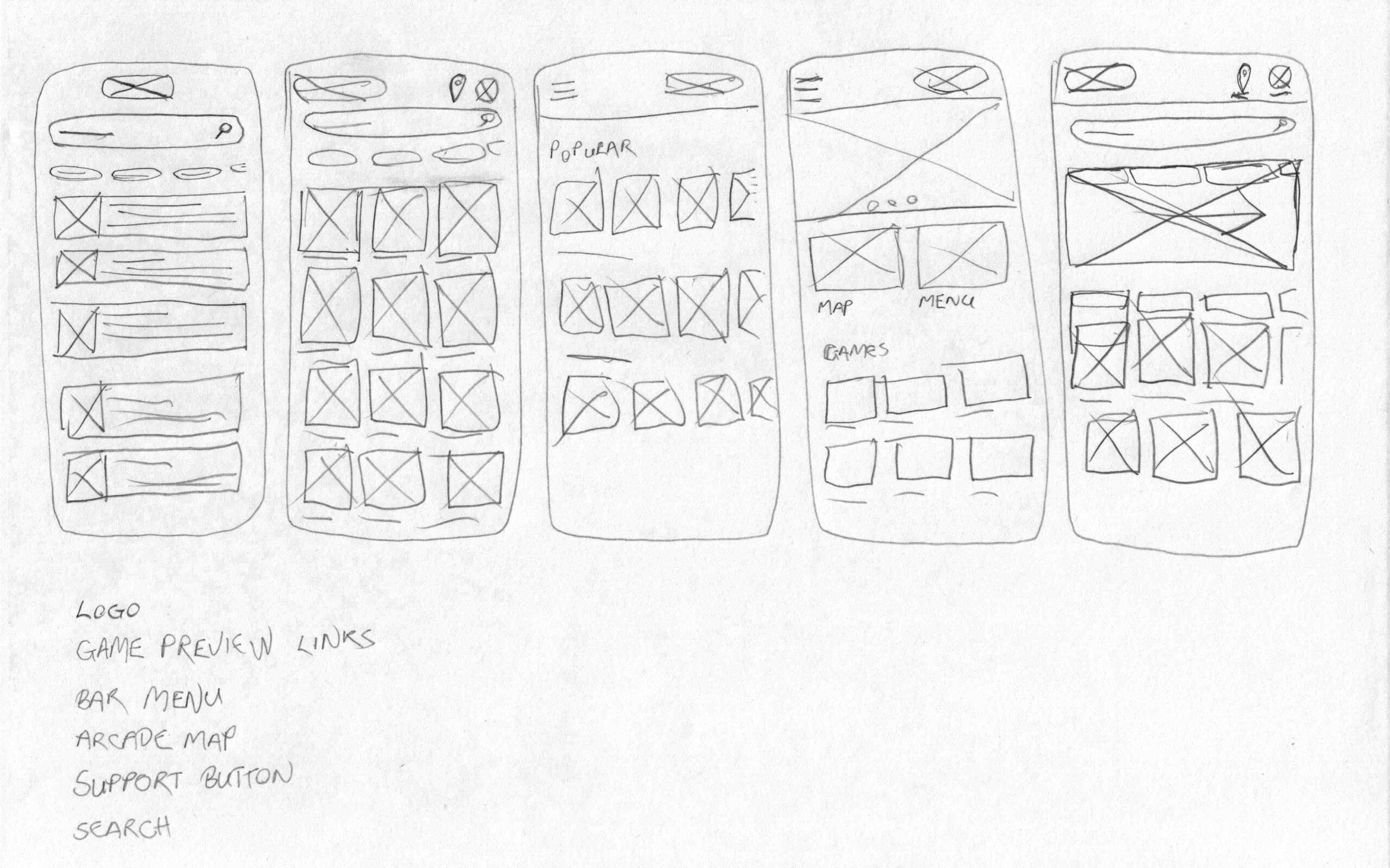
Paper wireframes
By creating multiple iterations of each screen in a paper wireframe I helped ensure the design would be suitable to address user pain points.
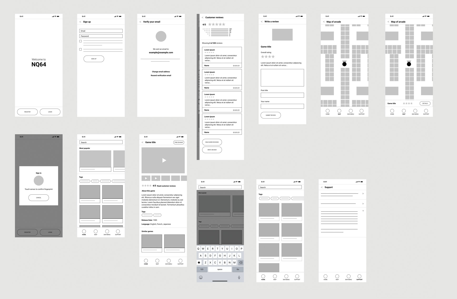
Digital wireframes & Lo-fi prototype
Initial designed all based on feedback and finding from user research. The map was a key feature for users along with easy navigation bar.
Usability study findings
Round 1 Findings
- Users were getting lost when registering
- Some of the micro-copy was misleading
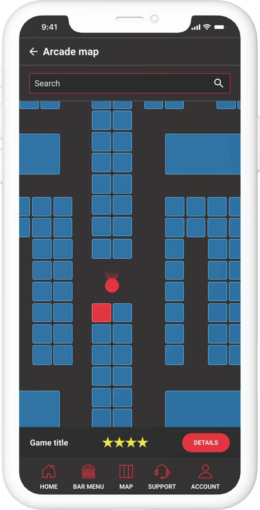
- The user flow on the map meant locating machines from the page was difficult
Round 2 Findings
- Changing language wasn’t obvious enough
- Text needed enlarging for readability
Mockups
Early designs had a landscape view of the games. I iterated so game previews were portrait allowing more on screen
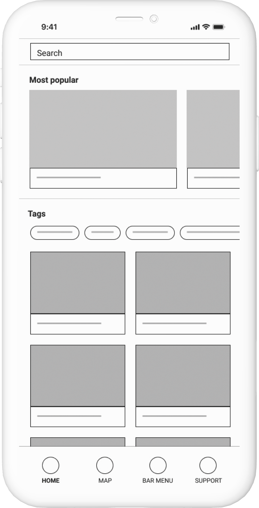
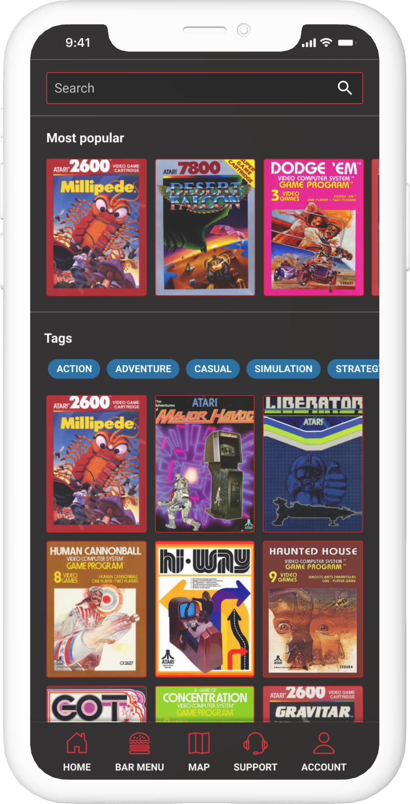
After usability studies I added a search bar to the top of the page, along with a games detail section that activates when one of the machines is pressed on the map


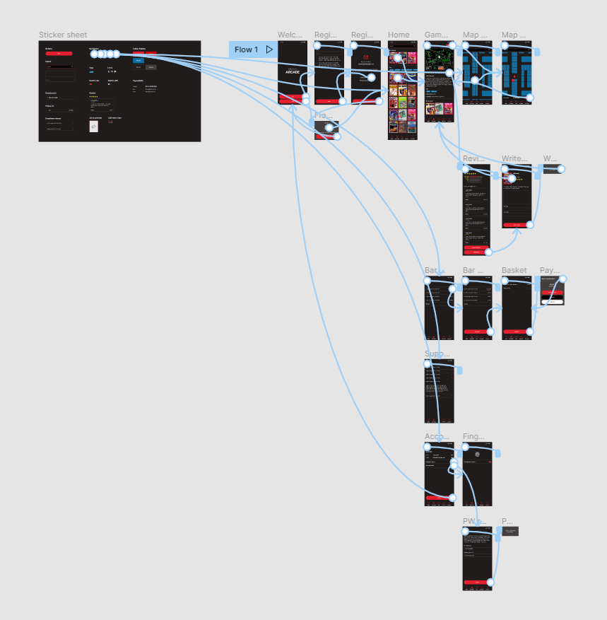
High-fidelity prototype
The final high-fidelity prototype was way more comprehensive and have user flows for everything possible within the app
View the game preview app
Accessibility considerations
1
Used high contrast throughout the app for people with visual impairment
2
Ability to turn on and off fingerprint sign-in dependant on accessibility concerns
3
Had option to filter games by language for people whose first language isn’t English
Takeaways
Impact
The app shows the arcade considers their customers’ needs seriously and wants to help them save time whenever possible.
What I learned
Usability studies help uncover some features that would have gone unnoticed. The map and menu features where only added after these studies
Next steps
1
Conduct another round of usability studies to see if pain points have been addressed
2
Conduct more user research to find areas of improvement within the app